 I am unsure of what font to use for the digipak cover, I have tried a lot of set fonts from Adobe Photoshop and browsed online for some exciting ones. I think this handwritten effect suits the photograph perfectly as it steals its colour palette from the background using the clone tool, but not necessarily the genre that Band of Horses portray as a band.
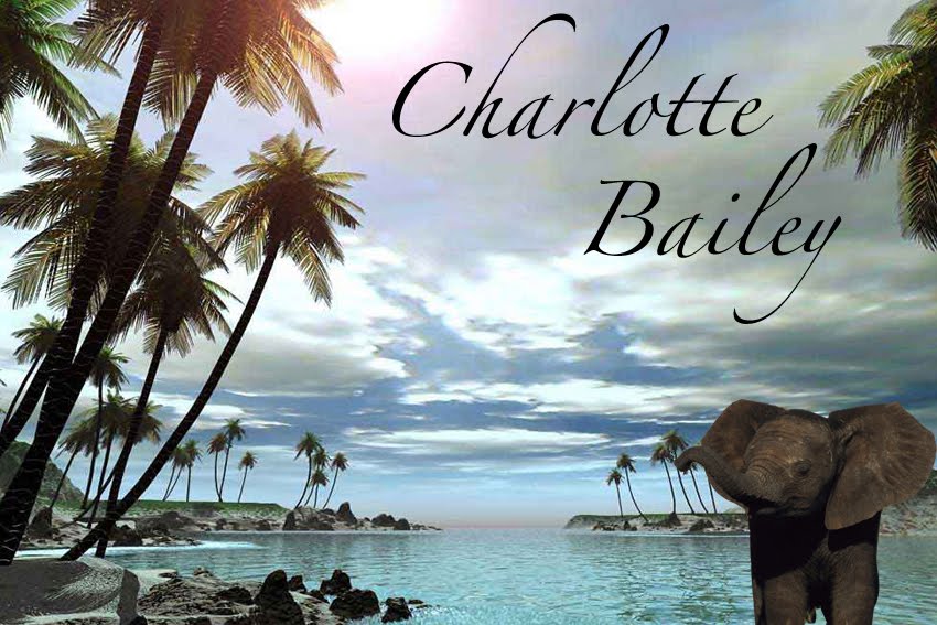
Also, the magazine advert is currently being designed by Alysha which means that we have to link the stylism of the two in some way to make them look like a genuine advertising campaign. The magazine advertisement is looking really strong and I think that it wouldn't be possible to use the same style of text upon a black background as it would look too two-dimensional and unstylised.
I'm going to keep playing around with new ideas to see what I can make of it and hopefully bridge the gap between the magazine advert and the digipak design.
No comments:
Post a Comment