
Friday, 28 January 2011
Wednesday, 26 January 2011
Feedback from our Roughcut

Our rough cut of the video was shown in front of our whole class and teacher so that we could get their feedback and improve our video dramatically. The main feedback that we got was that the gaps in the editing were too long; there was too much negative space. Some of our cross dissolves need editing and the argument scene needs a lot of work. We know that we have really got to work so hard these next few weeks as right now our video looks disappointing compared to what we hoped it would look like.
Monday, 24 January 2011
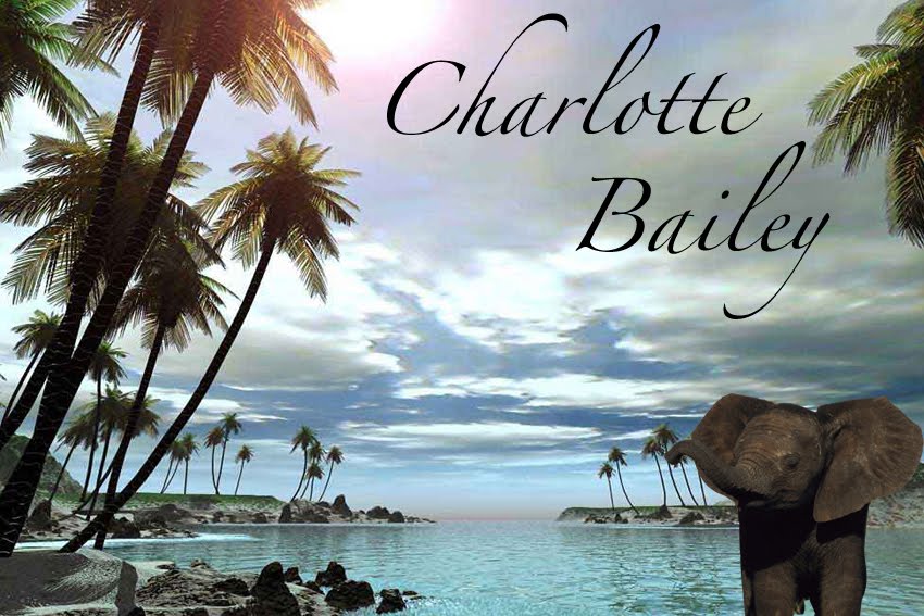
Fonts for the Digipak
 I am unsure of what font to use for the digipak cover, I have tried a lot of set fonts from Adobe Photoshop and browsed online for some exciting ones. I think this handwritten effect suits the photograph perfectly as it steals its colour palette from the background using the clone tool, but not necessarily the genre that Band of Horses portray as a band.
Also, the magazine advert is currently being designed by Alysha which means that we have to link the stylism of the two in some way to make them look like a genuine advertising campaign. The magazine advertisement is looking really strong and I think that it wouldn't be possible to use the same style of text upon a black background as it would look too two-dimensional and unstylised.
I'm going to keep playing around with new ideas to see what I can make of it and hopefully bridge the gap between the magazine advert and the digipak design.
Digipak Creation
I have been working on the digipak cover to try and make it look as good as possible. We decided as a group which photo we thought was the best out of the ones we had already taken. We really liked the aesthetics of this rose, the depth of field is really effective too as the softness of the transformation between sharp foreground and blurred background is really soothing.
I began by changing the levels in the colouring so that the red became deeper and overall much more vivid. It also meant that the leaf really began to stand out and conflict with the brightness of the petals.
 I kept this version completely in colour because I think it looks more natural and striking in colour, however, I also desaturated it and just kept the colour within the flower to see how this would look.
Although I really like the effect that this gives I feel that it lacks the cry for attention that the colour provides. I am not certain upon this decision however, so I will keep experimenting.
I also need to decided on fonts (remembering that it has to share many similarities with the magazine advert)!
Monday, 17 January 2011
Love The Way You Lie- Inspirational Video
We have taken a lot of inspiration from the music video of the song 'Love the way you lie' by Eminem and Rihanna. The video tells a love story of a man and woman played by Megan Fox and Dominic Monaghan, the story portrays the anger and lust that the pairing face on a day-to-day basis. Their relationship is extremely volatile and the argument scene and the romantic scene influenced us greatly.

This is a still from the video. It represents the happy times they share but in a subtle way. They are so focussed and connected and close contact that it is clear how happy they feel without needed to show any kissing or holding hands or any generic shot like that.

During the fight scenes we see a lot of close-up shots of her face looking extremely distressed and in pain almost. With this influence and the topic of our video we communally decided that when Claire is in emotional and mental pain, this can be portrayed with close-ups of her portraying her inner anger.

This fight consists of her walking through each door in house looking powerful and showing she has the dominance in their relationship as he is vulnerably following her, fighting for her. In our video it is the male that has the dominance in the relationship, Jack is the 'heartbreaker' and Claire is the one who has to suffer with the feeling of neglect and loneliness. However, the power that she has over him is something that is portrayed very carefully and clearly within this video.

This is yet another still from the later fight scene. It is in slow motion so that the viewer can really absorb the expressions on each of their faces. They both look pained; mortified and troubled. The passion in their faces really is awesome.
I feel for our fight scene we should focus more on portraying their expressions than the violence itself. Their expressions are what really show what is taking place here and nothing but good can come from trying our best to focus on their faces. Also, I think we need to incorporate using handheld cameras to add drama to the fight scenes as we have already done with the chasing scenes. Using handheld techniques will instantly alert the audience that something exciting is going to happen.
I believe that the fire in the background of the shot represents the danger of their relationship. They are a destructive couple.

Eye contact is a huge part of the success of this music video. I feel mesmorised when she locks intense eye contact with the camera. If we can get complete eye contact from Claire for one short clip I feel it could really add to the intensity of the video in general.

This shot shows him giving her a teddybear as a gift which she then hugs tightly. It is not the fact that he uses a teddybear to redeem himself, it is what the teddybear actually represents. It represents their happy times, the times they shared when they felt completely intact.
Before noticing this fragment of the video, we decided that a rose was going to represent their relationship and the time they spent together. We have shot Jack giving Claire the rose and the rose plays a repeatingly significant part of the entire video.

Here is the shot of the teddybear being burnt in the flames. In our video we have Claire destroying the rose out of upset, here the teddybear is being destroyed out of violence and destruction. Due to the representation of the teddybear, the fights have got too violent and too extreme that they both know they cannot continue. This has to be the end of them as a pairing.
Shot List- rough guide of shots and times
 This shot list was derived from the animatic and is only a very loosely based guide so that we know the times that the shot changes should occur.
Monday, 10 January 2011
Potential Magazine Advert Artwork!
 This is the image that Alysha is working with currently to create a magazine advert with. Using all of our combined Adobe Photoshop skills we are all contributing as to what we think will look good and Alysha is working her socks off dealing with her own creative ideas and I have to say that as it stands this original photograph looks barely recognisable!
Another Day of Filming and Editing Begins.
On Saturday we did another day of filming. We organised which scenes needed improving and redid them so that they were of a better quality than before. The filming took place in my house but we also explore the roads around my house and incorporate that into the running away shots. There is also a graveyard not far from my house that is absolutely ideal for the shots that we need to film regarding the grave so all of our filming takes place within the realms of Horton Kirby.
We have now got so much footage that we feel confident that we can begin editing for our final video. We have been filming for over 6 weeks and although we can't safely say that as the editing progresses none of the shots will need improving, we are happy with the amount we have achieved and feel ready to undergo intensive editing now.
Tuesday, 4 January 2011
Digipak Research
Another part of our coursework is to design a digipak for our song. A digipak is a specific type of packaging for compact disks. They consist of four pages that need decoration, and the disc itself.

Famous Cover Designs

This album cover is striking to the audience due to the image on the front cover. It grabs the attention of the public because of its simplicity, bright colours and randomness of the subject of the picture itself. I like these combinations of factors within this design, I feel it really accentuates the quirkiness of the band. I think it would be a good idea to mimic this level of effective simplity within the design of our digipak.

This digipak album cover is extremely simple and honest. The singer is sat on a chair angled slightly away from the perfect centre. Although we could not use the actual Band of Horses, we could use Claire who is the actress within the video to be the character on the front cover as she is recognisably connected to the song.

This album cover is a photograph that is taken in sepia mode of a visual representation of the word 'sundown' which appears in the album title. The relevance of the photo is very clear once the audience has read the name of the album itself. This is a very effective album cover even though it contains none of the band members on and no other people. I think that this cover would attract an audience because it portrays an idyllic and serene landscape that everybody would love to experience. Kings of Leon play music within the bounds of the same genres as Band of Horses so this research is definitely relevant.

Vampire Weekend produced this album cover which I find to be mildly controversial in a bizarre way. I find that it is completely different to those album covers that we are so used to seeing due to the fact that it is not a member of the all male band, and that it was taken over 26 years ago. The band instantly became fixated on the photograph and knew that they wanted it as their album cover regardless of the relevance or significance. The cover is extremely simplistic yet striking to the eye, I find it to be an extremely aesthetically pleasing design. It also gives me faith that somehow we can produce a realistic looking digipak design based on images that are not of an american four man rock band.

This is the artwork for The Last Shadow Puppets' debut album which is absolutely breathtaking. The band used a photograph taken in 1962 of a supermodel, once again bearing minimal relevance to the songs or the band but gaining recognition for its elegance and beauty. The framing of the photograph is what definitely makes it so appealing, the right-alignment of the girl counteracts the heaviness of the text. I adore the use of black and white with this image and the burgundy compliments this perfectly.
Subscribe to:
Comments (Atom)